Rethinking an everyday product, a splash of color downtown, and a complete identity overhaul—this trio of projects shows off the innovative design side of San Diego.
The Layer Knife
By Michael Ditullo
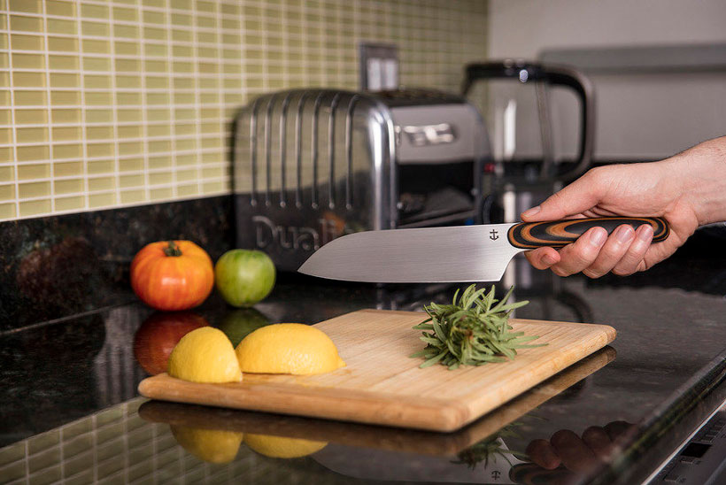
Industrial designer Michael DiTullo designed Leucadia Custom Knives’ blade with a handle that re inforces proper grip.
What was your intention?
Leucadia Custom Knives uses this really cool material called Micarta that is compressed layers of canvas or paper, so I wanted to do a shape or form that showed off all that layering. Some chefs like their knives narrower in the front—it feels like they have more control. We realized we could use this shaping to reinforce the way you’re supposed to hold the knife.
What was your inspiration?
When I was little, I liked to draw stuff from the future. I would open the Sears catalog to a random page, say, a power drill, and try to draw the future of that thing, which is kind of my job now. People ask what’s my favorite project I’ve worked on, and I always tell them the real question is, what’s the project I dislike the least. I look at every project and see how I could do it better now. That core trait of dissatisfaction is one of the most important things about being a good designer, because if you weren’t dissatisfied, you wouldn’t try to make it better.
What did you learn?
With this project, I learned all about traditional knife-making techniques, and materials I’ve never heard of (Micarta gets real grippy when it gets wet, and chefs like that). People don’t think about it, but every single thing you touch every day has been touched by an industrial designer. I mean this in the most humble way possible, but we can make something so special it becomes like a piece of art; it makes someone’s life a little better and brings people a little more joy.
Any challenges you encountered along the way?
It makes it so much easier when you have a wonderful client. The biggest challenge was that they’re a very small company, and I typically deal more with big companies. How can I work with LCK in a way that’s beneficial to both of us? But I was excited about a cool brand who wanted to do interesting things, so we made it work for both of us.
Scripps Research
By Made by Grizzly
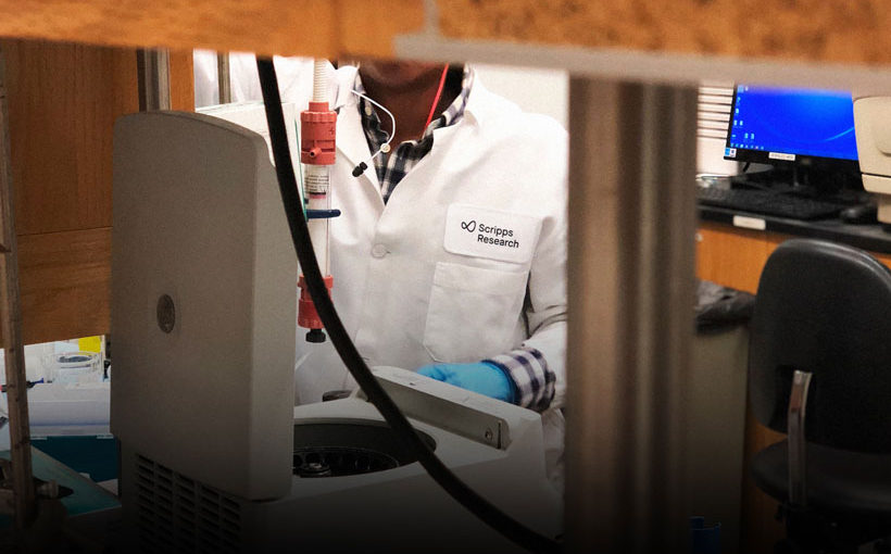
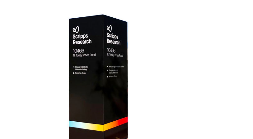
Scripps Research brought Made by Grizzly on board to update their identity so it reflects their achievements and advancements.
What was your intention/why was it necessary?
Scripps Research has seen some exciting changes in the last few years, but their existing identity, developed in 1993, wasn’t communicating their achievements and groundbreaking advancements in human health. Over the course of six months, we built a comprehensive new brand that truly embodies their mission to further the progress of human health.
What was your inspiration?
We found inspiration in the people who work at Scripps Research every day—their passion for the work they do was infectious. We heard numerous stories of how their drug discoveries have not only had an impact on millions of people around the world, but on the staff members themselves.
Their primary brand mark, the infinity loop, is a representation of their infinite pursuit of bettering human health. We also created an end-to-end color gradient that we felt best represented their broad spectrum of scientific work.
What did you learn?
We were inspired by the deep scientific research we saw, and the dedication to the institute’s mission. Through that, we learned how to best visually represent Scripps Research in a way that was accurate, modern, and fresh.
Any design challenges you encountered across along the way?
The biggest challenge was creating a unique identity system that captures both their history and their future. Scripps Research was founded in 1924. That’s 95 years of history to tell!
It was truly a group effort; because of that, we quickly caught on to what worked and what didn’t.
Working with clients who have an established history and staff, it’s often challenging to make everyone happy. Fortunately, the Scripps Research team is guided by an optimistic ethos and an incredibly collaborative work environment. It allowed for a level of transparency and trust that made the relationship—and the work—the best it could be.
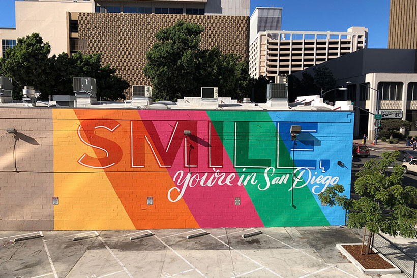
Smile
By Pandr Design Co.
The San Diego Tourism Authority hired Pandr to paint a mural for its “Something to Smile About” campaign commercial.
What was your intention?
The San Diego Tourism Authority wanted us to paint a mural that goes with the theme “Smile.” All our murals are very colorful and happy phrases, so we loved the concept.
The mural was for a commercial, but it’s also long-lasting; it’s a destination photo opportunity.
We specialize in creating social media moments. We know what people are going to want to take photos in front of. Instead of just “Smile,” saying “Smile, you’re in San Diego” makes it about the viewer. People walk by and feel connected to it.
We’re really about creating something that’s not an advertisement; it’s a fun photo opportunity.
What was your inspiration?
Typically, we’re really inspired by our peers on Instagram, Pinterest—all the social media places—and we’re constantly pushing ourselves to do something different. For this one, Roxy was playing around with overlay, making it look like the paint has a transparent quality laying over different colors, so making a 2D thing transcend and feel layered.
We travel a lot and don’t get too many opportunities these days to paint murals in San Diego, so we were really excited about the idea of painting something downtown, and something that would be engaging. We just wanted to create something eye-catching.
What did you learn?
We definitely learned a lot scouting the walls and knowing the ins and outs of downtown, which has really helped us. We started a nonprofit called Ladies Who Paint, which is the first all-female mural walk that we’re having here in the East Village. From September 28 to October 5, we’re flying 10 of the best muralists in the world to San Diego to paint a mural. The point is to empower women, especially female artists, get them more visibility, and donate this amazing art to the community.
We’re hoping to bring a lot more art to San Diego.
Any design challenges you encountered along the way?
Shanley Houk: The wall is about 54 by 22 feet, so it’s a big piece of real estate, and due to the constraints of filming a commercial, it needed to be done in three days, which is a very tight timeline.
Typically we’ll get there before the sun rises and paint well into the night, but when you’re doing time-lapse, you’re limited on lighting. It was definitely tough.
What we didn’t expect was the heat that week—the buildings reflect a lot of light. You really don’t think of that in September in San Diego; it’s still very much summer here.
There were just little challenges. We’re very much planners when it comes to our work; we like to have everything figured out ahead of time.
Tags: Creative, Design, Innovation, Scripps


