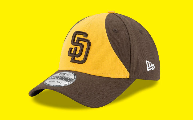
It’s official: The Padres are bringing back the brown-and-gold next year. Final uniform and logo designs haven’t been released yet, but the shades will be similar to those they wore from 1969 to 1984, when hair and moustaches were big and the team was World Series bound. It’s not just about the good old days, though. Having freshly inked a 10-year, $300 million contract with superstar slugger Manny Machado, the Padres are clearly looking to the future, too.
Considering the change coming to Petco Park, we asked marketing experts: When it comes to branding, what’s in a color scheme, anyway?
John Ball
Principal and Creative Director, MiresBall
Often, huge branding changes reflect that there’s been a change in the business—an acquisition or merger. For a lot of brands, that’s a signal to their audience that something’s different.
For the Padres, they’ve been building the talent base for the last couple of years, culminating in signing Machado. The timing’s right to say, “Now we’re ready.”
I remember when they were in the playoffs in 1984—Tony Gwynn in his prime—so those colors are kind of seared into my brain. They bring back a lot of memories. But with that uniform, there was a point where people said, “Those colors are ugly and you don’t look like a sophisticated Major League team,” so they made the switch to blue and gray. We look like we belong in the league now, but the flip side is, we look like all the other teams. It’s almost like they overcorrected.
Will Kelly
Manager of Marketing and Business Development, STN Digital
I think it’s been a long-play marketing technique, and now the timing is perfect. We have one of the best free agents locked up for 10 years, so it’s time to establish, or reestablish, the older identity of when the team colors were brown. The front office and ownership is saying, “We’ve heard the fans, we know this is something they want.” It may also have to do with the Dodgers being a big rival, and of course they’re also blue.
Vasilis Dalakas
Professor of Marketing at CSU San Marcos and Visiting Professor at SDSU
Uniforms are an important part of a sports team’s identity. They carry a lot of significance and meaning for fans. These colors are associated with the Padres’ first appearance in the World Series, so it’s a nice move capitalizing on nostalgia. And for younger fans, it will differentiate the team and automatically say “San Diego Padres.” They’re trying to create a new identity, in terms of being more competitive.
Throwback Culture
The Padres aren’t the only ones going way back. Here are three other local retro success stories.
Modern Times
The craft brewer and many of its popular beers are named after utopian experiments.
Before Crowds
Del Mar–based Rusty’s ’80s line evokes a time of bearable beach crowds and fewer surf celebrities.
Turntables
Sony Electronics says old-school turntables are “in.” Today’s can extract digital files from vinyl records.


Oh boy, who is designing the uniforms? Will there be a public vote? I will start off with my vote. Ban the Sunday camouflage uniforms please. It’s baseball people, not the military base. Leave that alternate jersey for Military Day…OK?
To say the team and fan base building is “culminating” in the signing of Machado is not correct. This team is being built by developing young players, with the addition of a few veterans like Hosmer and Machado. Building the fan base will continue for at least a few more years as they continue to bring up their young talent and start winning.
The timing is really related to Ron Fowler’s desire to find a distinctive uniform and stick with it, rather than changing every few years. That’s what the best organizations do-Yankees, Cardinals, Dodgers-to name a few. Even though he is not a fan of the old brown, he’s been convinced by the fans to get back to that distinct brand identity.